Throughout development of the Electric Zine Maker I’ve been trying to find some time to finally talk about UI, and how important it is to view it as part of your “world building” rather than just UI work.
All of my work heavily relies on UI to convey the message of the game, or further build on it.
To me UI is just as important as, say: dialogue, music, design… if done right it reinforces the themes of your game, and even builds on it in a way that you might not be able to convey anywhere else.
So, OK, without much of an introduction I’ll dive right in…
My favorite thing to do is to use UI counterintuitively to build on senses of helplessness, like reality is somehow disintegrating and things don’t make sense… this works well as a platform for humor.
For example, the minimize button doesn’t have to just minimize. It could cause the app to complain and protest that it has just been minimized.
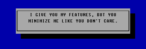
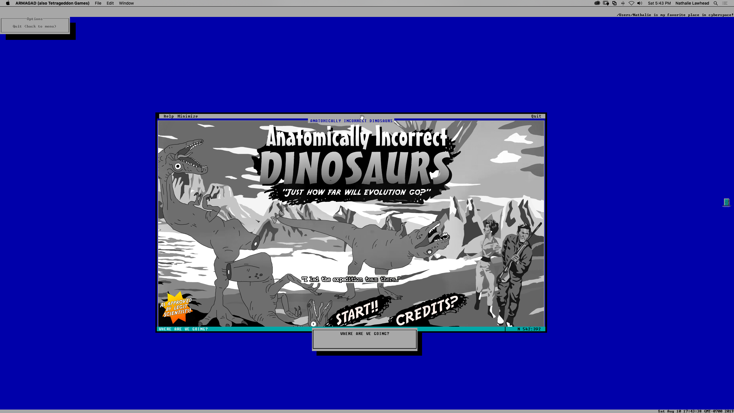
In Anatomically Incorrect Dinosaurs, if you minimize the game, the game starts crying and singing “baby don’t hurt me” in a weird robot voice. An interesting note to make in the way UI is used here is that the UI is an actual character in the game. It has a voice assigned. It talks if you do things… Like if you move the window around it starts saying “Weeeee!”, as if it’s enjoying the ride. It gets mad if you quit the game, and has a final closing remark before fully quitting…
The way UI was approached here is that it’s an actual character. It’s a way to frame the game in a 3rd wall breaking sort of way. At this point the game is even a self-aware entity that you play with WHILE actually playing the game. It’s a wonderful way of layering interactivity, and introducing surprise elements that drive jokes across.
Using UI as a character is very effective and I did this a couple of times.
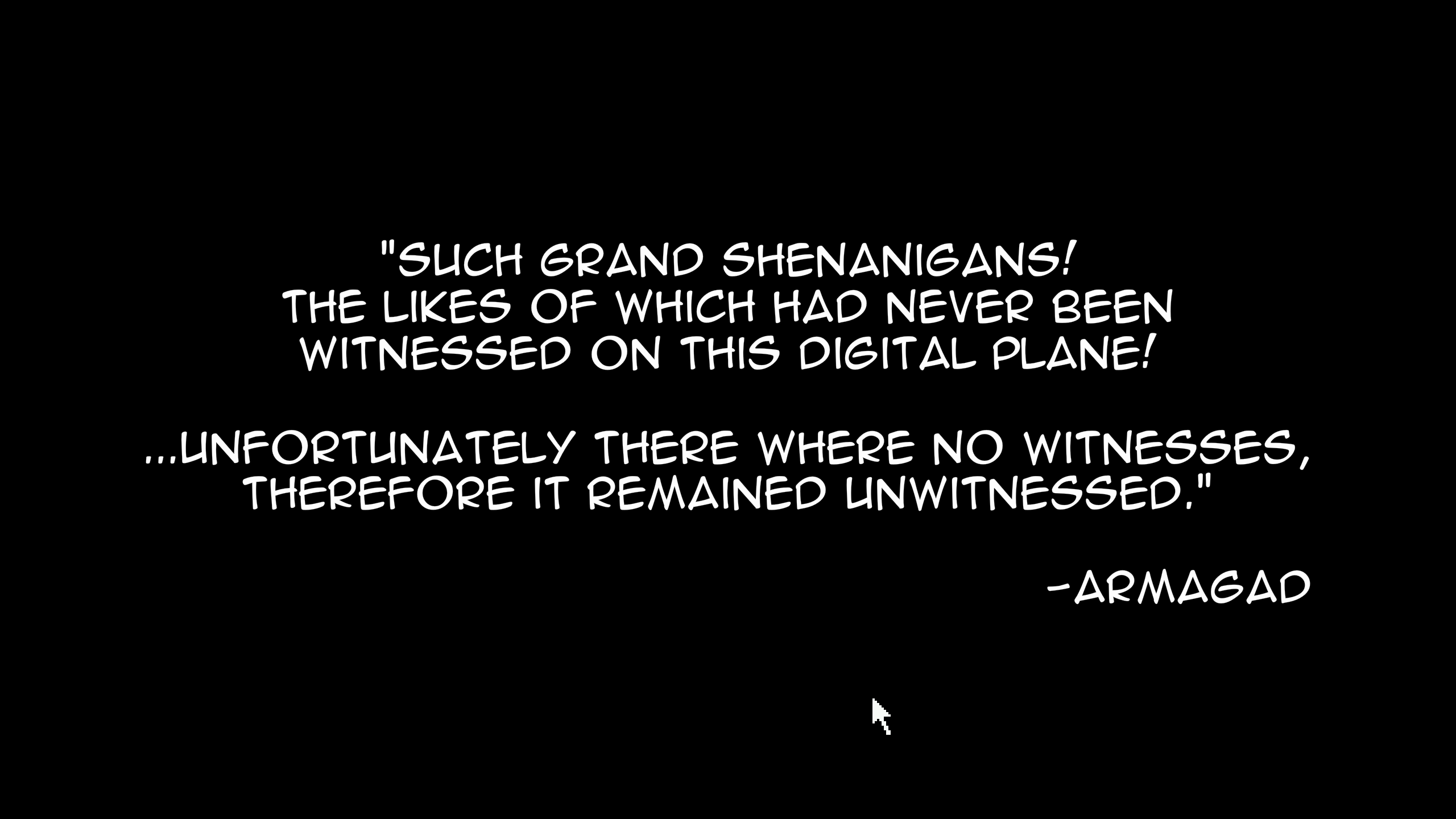
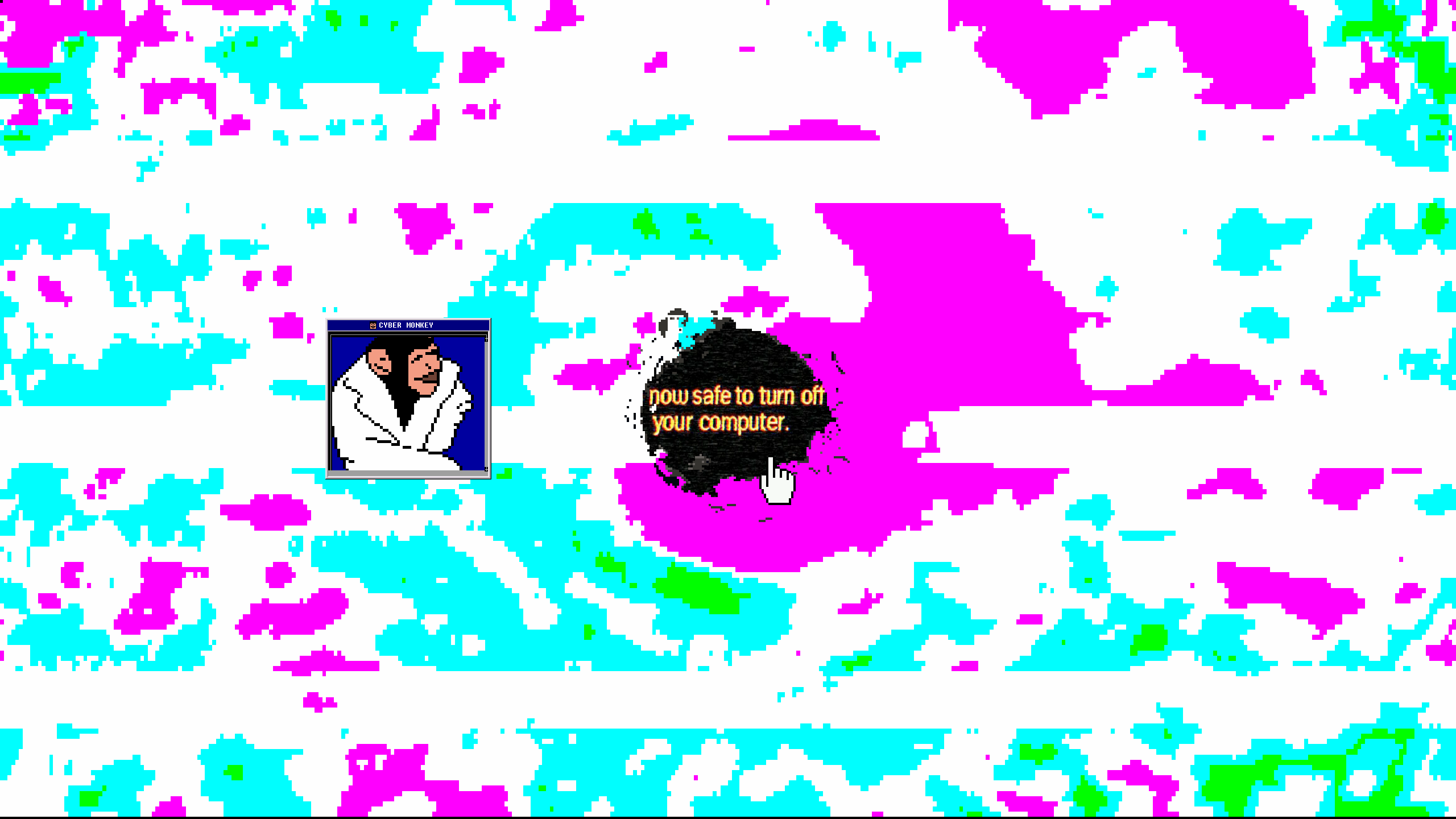
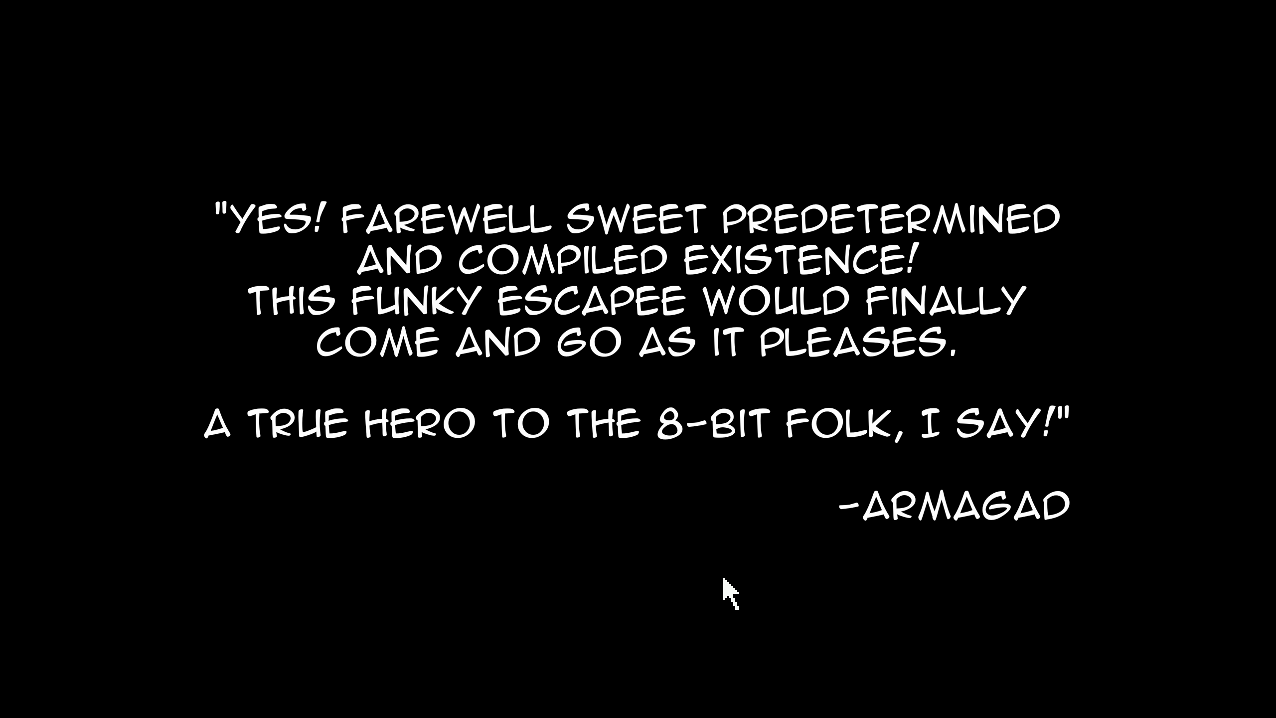
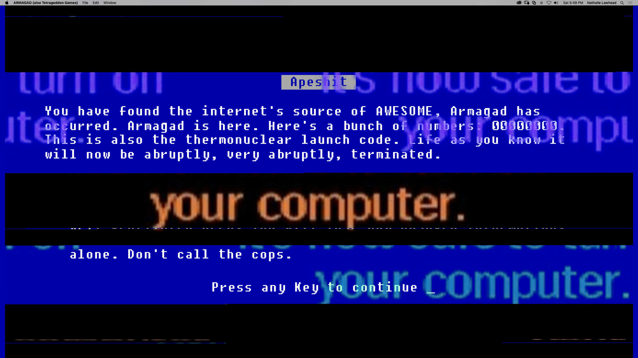
Anatomically Incorrect Dinosaurs is an actual character (with personality design), and ARMAGAD (the desktop version of Tetrageddon) is one too.
ARMAGAD is less obvious and you kind of have to discover it. It will talk about what you do, and functions as a narrator. ARMAGAD is the invisible god character of the game. When you help Cybermonkey escape you encounter a lot of it. ARMAGAD will narrate what Cybermonkey is doing, and it almost feels like the game is playing itself with you.
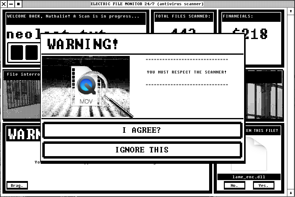
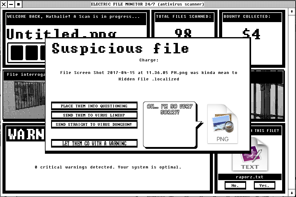
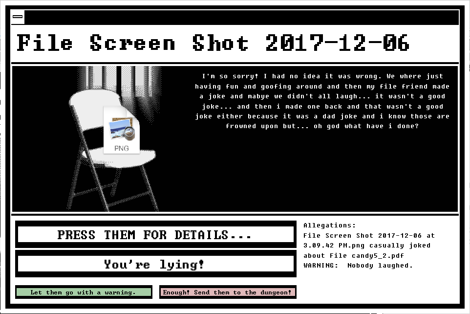
In some instances the UI can be a game in itself. See Electric File Monitor.
Electric File Monitor is parody software that sells itself as a “prison industrial complex for your computer”. You scan your computer and it will accuse random files of being dangerous. You can place these files in interrogation, or a lineup, and determine how to punish them based on which files you like the least. Files will often plead their innocence, and beg… In this case the entire game happens as a UI. The software itself is a character that you are interacting with, and it turns your computer into the game.
So as you can see, there are a lot of wonderful ways to approach UI design… Your UI is a character, your UI has personality, your UI has volume, depth, distance… your UI is an actual breakable environment, your UI is used to reinforce the “fever dream” element of a game.
A cute example in terms of UI being a breakable environment, with physics and gravity, is the Electric Zine Maker website. In many pages the UI has physics and reacts to gravity. You can throw it around, or break it entirely.
This isn’t the first time that I used UI as a physical object, but it’s my first use of it in a website. I think it’s successful because using physics + UI this way makes things very playful. It almost feels like a small playground that you put someone in. It’s hard to resist throwing things at something when given the option.
My most recent work that really explored all the ways that UI can evoke emotion was “Everything is going to be OK“.
A big part of “Everything is going to be OK“s UI is themed to draw heavily from vintage GUI’s and other OS elements. I was surprised by how people noticed the reference! Alexander King actually wrote a very detailed breakdown of it in this medium post. It was pretty amazing that someone “got it” that much.
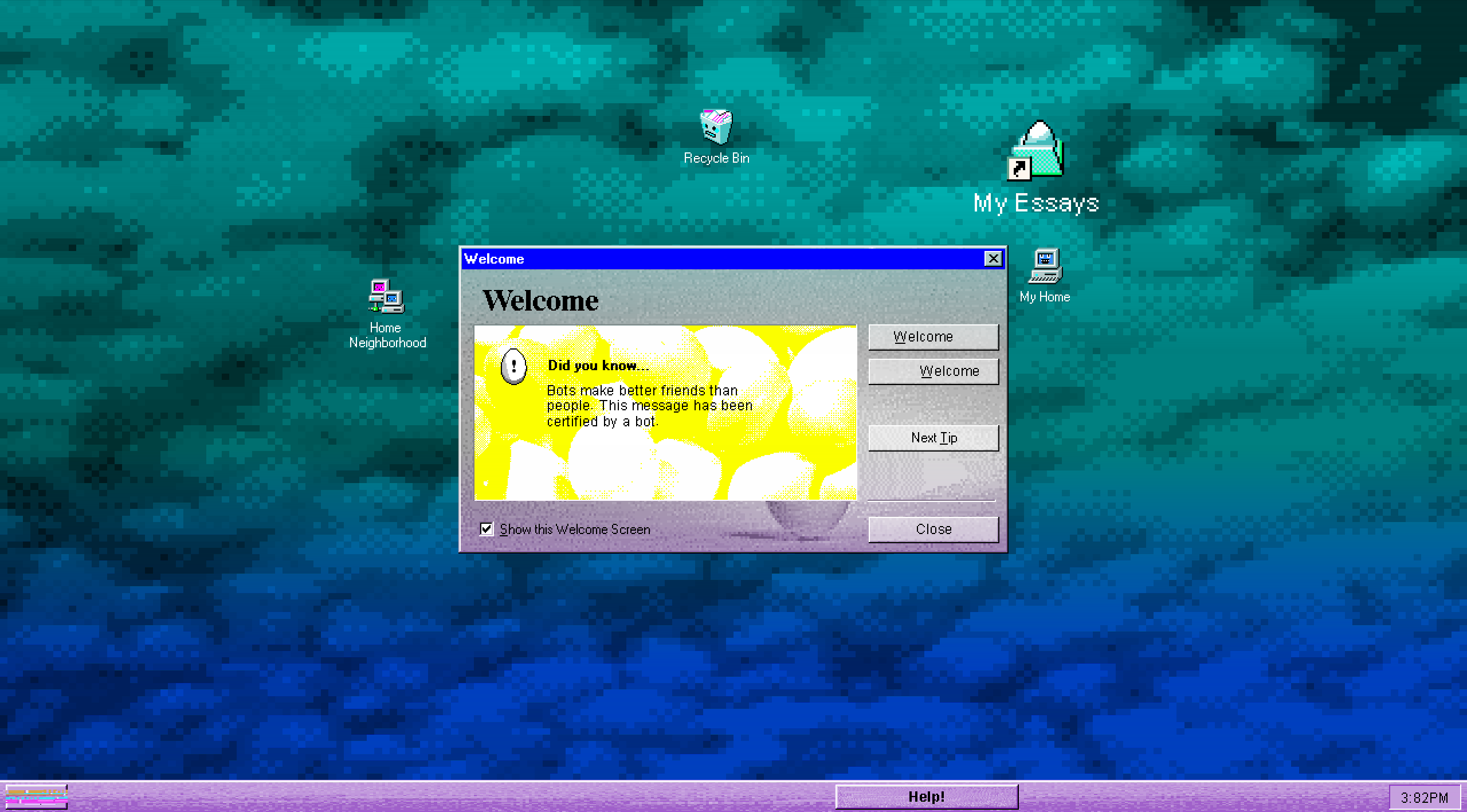
“Everything is going to be OK” is a game that’s heavily structured around vignettes (small impressions) of life experiences. It’s a personal game. There are very intentional reasons for using UI this way, to convey these messages.
The historic GUI’s create a sense of familiarity and approachability. In many ways it’s a type of comfort zone for interaction and playing with user experience.
There are SO MANY charming things about the strange environment that a desktop is, and how we’ve all learned to interact with it. A lot of this is considered to be a type of “interaction vocabulary” (see UX), and understanding this behavior is almost a language in itself.
If you understand it enough you can subvert it (as much as I hate using that word, that’s pretty much what happens here). Sneak in little details that go against what people expect. If it’s done right, and to just the right degree, it can make the environment you’re building feel very much like a fever dream.
Small UI elements talk back to you, you get sucked into something you thought looked harmless but it’s actually an entirely new scene, interactions pile up to a point you’re not sure where you are anymore like you’re navigating a maze rather than a structured functional environment…
How we are used to operating in a computer is very vignette and collage-like in itself. Viewing your desktop as an environment; things tend to be very broken up with how windows, tabs, separate software, all runs at the same time. Everything demands your attention, but each is a separate world in itself. This is a very interesting setup to explore for telling stories.
Like, examine what it’s like to interact with a computer… When you use your desktop, different windows open, different things happen in each, they are mostly unrelated isolated activities and tangents in each, you close them, go off on other tangents, windows open new…
Since we are so used to using computers this way there is a common agreement in regards to what behavior we expect in these environments. We expect certain functionality of these UI’s and systems. If they do not behave the way we expect (our agreed on interaction language) it’s almost like a betrayal on the computer’s part when it does the opposite.
I mean, it’s so interesting when something crashes, and how people can get mad at that. It’s a machine. It doesn’t know to care, but it’s almost personal.
It’s really fascinating to make something that rejects these suppositions. People genuinely feel a loss of control. Like they’re not in charge anymore.
Anatomically Incorrect Dinosaurs closes itself when you’ve reached the end. It throws a very bizarre random video at you and then says “Goodbye!”. The program is closed then. There’s a sense of emptiness you feel… like you went on a wild ride and had no control over any part of it.
“Everything is going to be OK” has so many instances of this. Games will close on you when you reach the end.
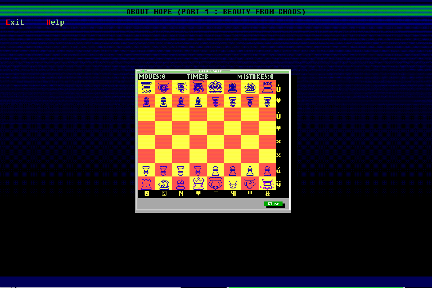
In one case there is a chess game. You can actually just move the piece directly to “consume” the king or queen but people tend to play it like it’s chess. It takes them a while to realize that interacting under their conditioning is actually not necessary, and it’s funny to see them realize that.
The chess game also just degrades as time goes by and playing it becomes almost impossible and pointless.
UI is a functional stage that we easily understand.
A famous non-UI example, but still as applicable: pretty much everyone knows they should go right when shown Super Mario’s Nintendo game. If you make the action of going right pointless, and the true way to “win” is to go left, it literally takes them forever to question their mode of interaction & why it’s failing them. Once they realize that the opposite of an expectation is true, it’s like you just freed their mind or something. The emotional range that you can get by just changing that one thing is a truly interesting space to explore.
A space like this is a good area to discuss issues in, and present interesting fragmented content such as fake programs, branching stories, or layering content in interesting ways for people to lose themselves in. You’re essentially creating an emotional space.
I think this in particular is a very important thing to understand: UI is an emotional language.
There is an emotional reaction that happens when a computer doesn’t do what you want it to do (things crash, close, errors = confusion, loss, chaos). This is something you can use to enhance your game’s theme. Work with the ways that UI is emotional.
In case of old-school GUI’s and OS’s it’s a wonderful space to place stuff in because it’s just far enough in the past for people to remember what to expect, but not too close that they might have too complicated expectations from it. It’s kind of like a ghost ship for personal messages. You can use people’s nostalgic expectations in a humorous or deviating manner to surprise them.
In “Everything is going to be OK” it adds to the feeling of being in a fever dream, lack of control, and often so strange it’s humorous.
The varying character of UI (especially old-school) is also a great realm to work with. I have a very long Twitter thread here that I constantly post to.
Old UI resources thread:
…
Favorite old UI resources on the internet:https://t.co/ec31LFAUoC
and especiallyhttps://t.co/H9Bs06W0jU
… pic.twitter.com/6rk1v60wHQ— Nathalie Lawhead (@alienmelon) July 29, 2017
Old computer systems were clumsy in their UX work.
They already had character because of their flaws.
For example, buttons were too large, other things were too small, fonts were strange, colors were too strong, improvised graphics that look like they are placeholders but somehow stayed… This ended up creating a strong sense of character for how “bad” or clumsy it was. UI was just trying to figure itself out then, and the lack of rules made it really interesting.
See Microsoft Bob as an example. An actual environment was used instead of a desktop. The fact that a major company like Microsoft actually took the time to make something like this is just amazing.
There were other cases where people tried to use a “real environment” like a 3D desktop, instead of your typical UI. For example there’s 3DNA
Older edutainment software did this frequently too. Like Microsoft Encarta’s Mind Maze.
The distinction between re-inventing the wheel, and trying to improve something is a gray area. It’s wonderful to examine these failed instances and understand why they failed.
Toastytech is a great resource for this.
I don’t want to talk about old-school UI too much, but one final point that I think is important about it (and why we have such fond memories of it) is how it benefited from its flaws.
Computers then didn’t feel like you were in a highly polished, corporately branded, productivity machine. The environment was personal. The extent to which people would often go to theme their desktop speaks to that. See the Windows 98 – 2000 themes, and the communities around creating icons for it.
Personalization of a space is important because it gives you a sense of ownership. Without it you are more of a “visitor”, instead of it being a home.
Desktops have been traditionally called “Home”. It’s still part of the naming convention. I think this is a relic from a time where people still aspired to make it a personal space that you lived in.
We’re seeing this slowly being lost with the way newer design models are pushing corporate branding over these spaces.
For example, both OSX and Windows have a strong polished commercial presence, and the space is strongly controlled by them, rather than the user. Mobile (OSX and Android) is a completely lost cause when it comes to user freedom… This is more of a conversation for another time.
I would argue tho that the way we look back at these old desktops, spaces, UI’s is more than just nostalgia. It’s the point in which we really owned our own personality on our computer and had a space to express that with UI.
Any type of modern software, especially art software, functions under the premise of maximizing productivity.
Even websites today are all about UX to maximize retention, clicks, interactions…
It’s a type of language that has become almost exploitative in how it treats its users, and I think this is why we love looking back at a simpler time when we had more freedom to just “live” in a virtual space without being milked for it.
Flawed UI is comforting because it tells you right off the bat that a human made this, and that you’re not in a “high stakes environment”.
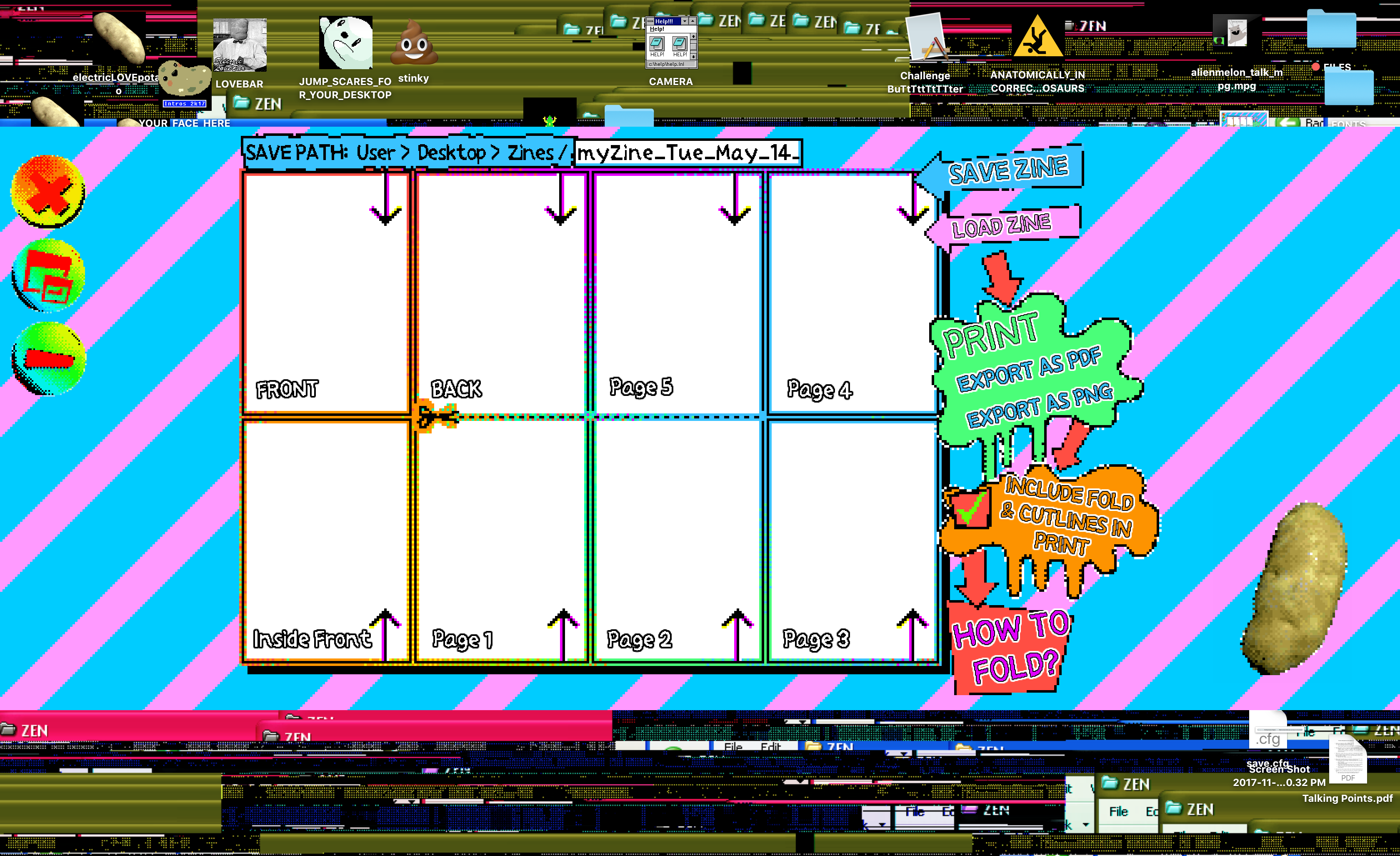
So this is where I get into the Electric Zine Maker, and how its UI is being used to make a “low stakes” type environments that people can explore creative impulses in, without feeling any urgency to make something professional.
Art tools today are very polished, very productive environments. A lot of work goes into streamlining the process of whatever art it’s intended to specialize in.
If you enter Photoshop, you are IN an art tool that’s meant to make money, and make professional art in. I think when you’re in these spaces there’s always a feeling that you have to be “good at it” and make something notable. There’s the looming feeling of productivity always hovering. Don’t dare draw a stick figure. It’s not meant for that!
This can be intimidating to people that just want to make something goofy. A large amount of people want to make art without being reminded that it has to be “Good Art”… So this is a space to create with UI and design decisions.
The Electric Zine Maker is a zine creating tool meant to make Zine Making as non-intimidating and approachable as possible. It’s low stakes right off the bat. Because it looks so silly, and goofy, it’s not going to judge you for drawing a dick in it. It’s not going to judge you for drawing stick figures. It’s ok to not be good at something, and even just do dumb shit.
I think it’s REALLY important to lower the stakes when designing a tool that’s meant to draw in people who might be skeptical of even just TRYING to make something. You have to re-assure them that it’s ok not to be good at it. Being creative doesn’t mean you have to be a professional genius at it. It’s good to be bad.
The UI of the Electric Zine Maker is intentionally big. Things look goofy, and the layout is very playful. There’s a potato in the corner to positively reinforce you. It acts a bit like clippy by being a tooltip. Goldfish are floating in the background because why not. Having some elements of pets, animals, or whatever else can be comforting. It’s charming.
I think if you’re building an environment like this, color is very important. Granted, I exaggerate with my use of it and in this case it’s more of a personal decision rather than intentional, BUT you should strongly consider some level of color use when building a UI that communicates low stakes.
The design inspiration for the Electric Zine Maker was “cartoon”. You’ll notice that when you interact with it literally every element in the UI is animated. Unfortunately I didn’t use any interesting UI specific references for it. I drew from the work I did when working at Disney. I did a lot of UI work like this way back. Cartoon aesthetic typically involves a lot of slanted, non symmetric shapes. The most important thing is to come up with your own style-guide and stick to it so it’s not TOO random, but just enough to convey a sense of playfulness.
A lot of people compare the Zine Maker to old edutainment software, and I think it’s rightfully so. Edutainment is probably one of the biggest places where people take UI risks, and give “goofyness” precedence over usability. Kids love color. You need to make the environment silly and imaginative in order to maintain that attention.
(there are good screenshots of it on the myabandonware site)
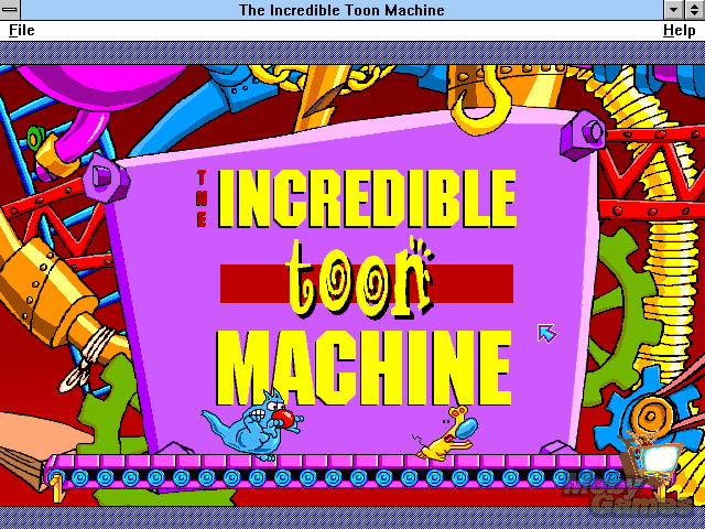
For example, the Incredible Toon Machine is something I feel like REALLY needs to be talked about more.
This game was simply brilliant. I’m still blown away by it and how complex it was. As a game, I think it did a very interesting job at kind of subverting design. Kind of in line with the game doesn’t have rules, you make your own. Build your own environment in it and watch things react. This led to a lot of interesting creation in it.
UI wise, The Incredible Toon Machine is very colorful. Very goofy. Very playful. The sense you got from being in it was fun. It’s a title worth looking into.
Another one I think that’s important to look into is Mario Paint.
I’m typically not one to strongly praise Nintendo since I feel like their games dominate too much of the design discussion. Overall, console games are given too much analysis in my opinion, but… Mario Paint was a weird one that I feel like deserves analysis for how bizarre it was.
This one was a painting program. It was silly, and made noise when you painted. Most tools actually “took time” to happen. For example, the paintbucket tool had to animate. It made kind of a paint pouring sound as you watched and waited for the color to fill in.
The tools for making art in it were fairly strange. Aside from that it had some strange tangents. Like there was a fly swatting game in which you swatted flies. The types of bugs kept getting bigger and bigger until you fought the “big bug”.
The music creation program in it was fairly silly too.
UI reinforced the goofiness throughout. It was playful and cartoon-like with lots of color.
You should look into it! It’s worth deconstructing.
In terms of tools, I think these old programs make some interesting functional decisions that we don’t really see in modern art tools…
Mario Paint had a stamp feature, and you could create custom stamps for it. Most older art programs had this. Dabbler 2 had a stamp feature too. I think it’s fascinating how old art programs kind of “invented” tools, rather than completely trying to imitate reality. You could get these completely off the wall features that you weren’t sure how to use until you actually started making art in them… then they kind of made sense.
Before we started to imitate “real world” art tools (like chalk, pencil, watercolor… textures…) we had experimental computer inspired tools. Things only made possible under the premise of a digital environment.
A very good example of this is Kai’s Power Goo.
The interface design of Kai’s Power Good (and the other tools) was amazing. Something like this would never make sense if you didn’t have the context of “computer”. These tools were bizarre, eccentric, almost not usable, but you found a place for them. The Goo one is probably the most famous example. Basically you could smudge and distort things… imagine using a photo as if it was clay.
Kai is worth looking into not only for the interface design, but for the type of tools.
Make tools that reject mediums that happen in the “real world” and can only exist in the virtual. Tools that don’t imitate anything but invent themselves, and exist as something of their own.
See also, BECOME A GREAT ARTIST IN JUST 10 SECONDS.
So that was a lot of ground to cover, but both the UI AND the tool design of the Electric Zine Maker go hand in hand.
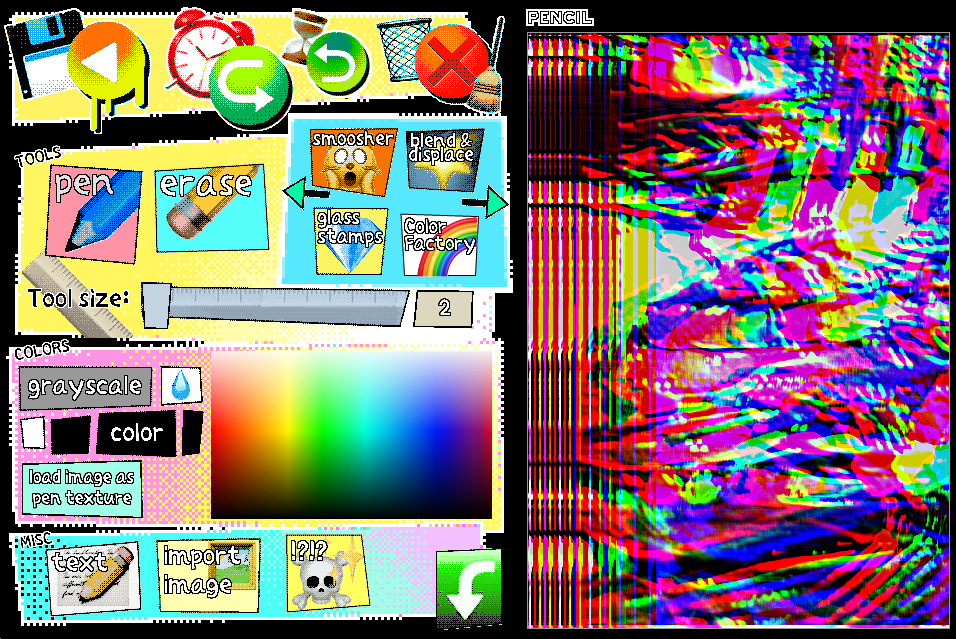
Some of the tools in the Zine Maker are completely virtual. They don’t exist in the real world, or in other art programs. They are something you explore and discover uses for.
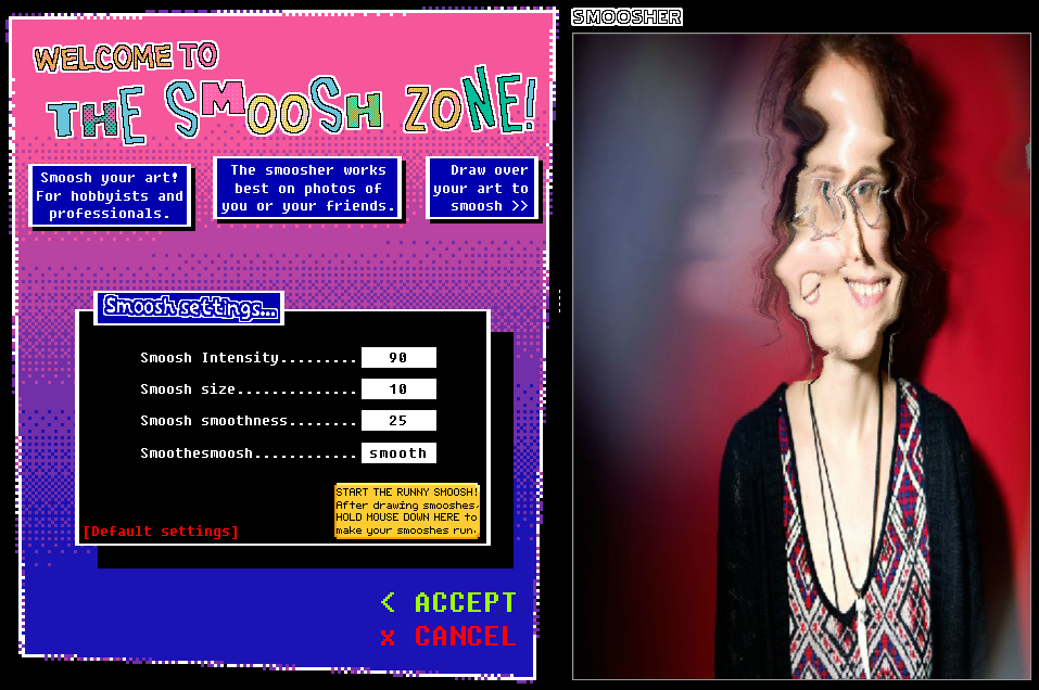
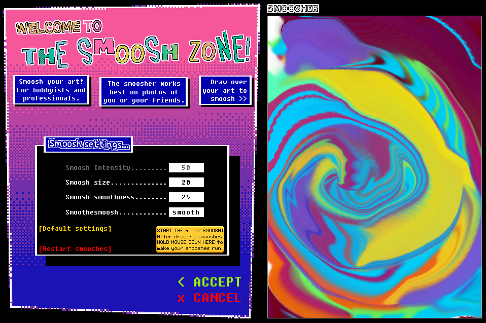
There’s a throwback to Kai’s Power Goo called The Smoosh Zone that lets you smoosh photos. You can also make all your smooshing “run together” by clicking a button. This essentially makes all the colors run into eachother based on your smooshes (as texture).
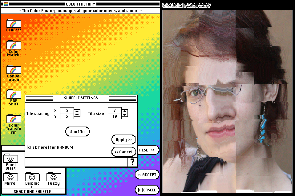
The Color Factory features all sorts of strange color manipulation, like Convolution or RGB shifting. You can even make your art into ASCII art.
The Displacerizer lets you import images and layer it over your art. Like you could use ASCII art as a displacement map for your art… So at this point you’re coming up with ways to use all these strange things together to make strange art.
The Glass Stamps tool lets you stamp distortion. If you wanted to you could set the size value to 500, select the “draw” option, and run it over your art. This makes a really interesting “flying into your art” effect… so you’re watching these distortions happen in real time and you can stop at any point and use what you stopped at.
There’s A LOT to this.
Many tools in the Electric Zine Maker come with their own interface where you can manage values and settings. Each interface is custom and looks different. The interface design here is intentionally “different” to make each tool kind of like a different space that you are entering. It’s meant to evoke a feeling of exploration.
It’s just as much about exploring, and discovering, as it is about just drawing something.
A lot of the work I have been doing lately was created under the premise of avoiding calling it a “game”, but in case of the Electric Zine Maker, I’m very much viewing it as a game.
It’s meant to be a game.
The same way as you build in something like Minecraft, and figure out all these combinations for building objects, you discover tools in the Zine Maker and figure out how to combine them to create effects.
That’s the premise of all the tools being added.
When I was showing the Electric Zine Maker at Playdate during the LA Zine fest it surprised me how effective this all was!
People passing by would see it and say “oh my god this is adorable…” (the phrase was used often)
It looks inviting. It’s colorful, and acting cute. All this draws people in. It’s disarming on the surface.
As they interacted with it, they ended up getting really involved. Some people spent 20+ minutes with it.
This was also the first time that I saw both very young people, and very old people enjoying something I made. The age didn’t seem to matter.
One older lady was very skeptical when she sat down to play with it since she didn’t feel very inspired, and thought she wasn’t going to be good at it. She ended up spending a very long time making art using just the smugger. Her comment was that it was surprisingly therapeutic.
So I think I accomplished doing what I wanted to do with it. Make a tool that’s inviting, and encourages low stakes art making.
All these elements work surprisingly well together. I think when you’re setting out to do UI work, it’s important to have a concrete goal. In every case that I mentioned, I had one.
Ask yourself what you would like your UI to communicate about your game and REALLY theme it around that.
Try not to make UI separate from the game, but REALLY make it part of the game, so much so that it’s hard to know where it begins and where it ends.
What I would hope this post encourages is to stop viewing UI as something boring. It’s important to view it as a creative thing, and question your approach to it. View UI as a living, breathing, environment that you are building.
UI is part of the world that you are designing!
3 Responses
[…] of creating stuff on a computer with these silly edutainment programs, or things like Mario Paint (which I regularly gush over in my posts). It says a lot that things like Kid Pix are still talked about. That people still seek out these […]
[…] tools by small devs, shareware, and freeware (art tools, music tools, and toys to create with) on UI design & using UI as a means to tell a story, convey emotion, create personality… a… games as found objects & virtual relics walking sims and the joy of existing in a […]
[…] I end this post here are some links that I links that I reckon you should give a look at.An article where Nathalie lawhead discusses UI as an artform.A collection of zines made with EZMA zine from that collection that I really like called […]