This post is an extended writeup of what would have been my GDC2020 talk. Since the conference has been postponed I’m sharing parts of this talk as a blogpost (I elaborated on what would have been my talk. This post is much longer).
Last year I wrote about some of this on Gamasutra (link here). I also have a twitter thread where I’m collecting links to historic UI’s (link here). It’s kind of a source for inspiration.
Also, here’s a youtube channel of interesting synth UI’s…
There’s lots to be inspired by! UI design can be pretty amazing :)
UI is a strong area of interest for me since my own work leans heavily in the direction of fictional OS’s, parody software, fantasy internet, all of which use UI as the main avenue of interaction for my games.
The purpose of this post is to be inspiring!
It’s to challenge preconceptions, and kind of “misunderstandings”, that come with UI design that give it the perception that it is boring, tedious, uninteresting, or not creative.
I see indies often complain about how frustrating UI work can be when they’re building it for their game.
I think this is a really sad outlook to have for UI.
UI is an amazing space to communicate interaction.
UI really IS creative work. I hope (after reading this) that you will be inspired to look at it differently and enjoy UI work.
Examples of games where UI shines as the star of the game…
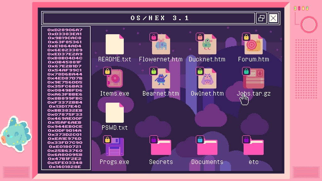
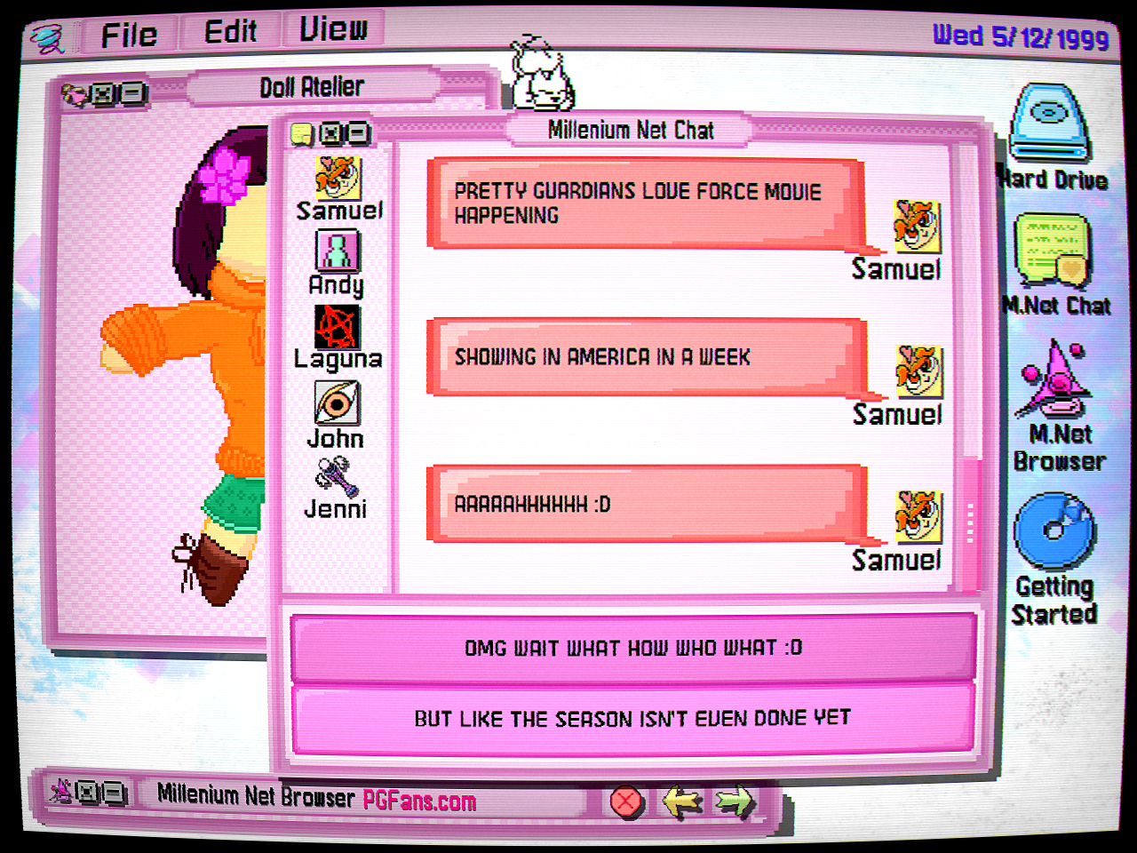
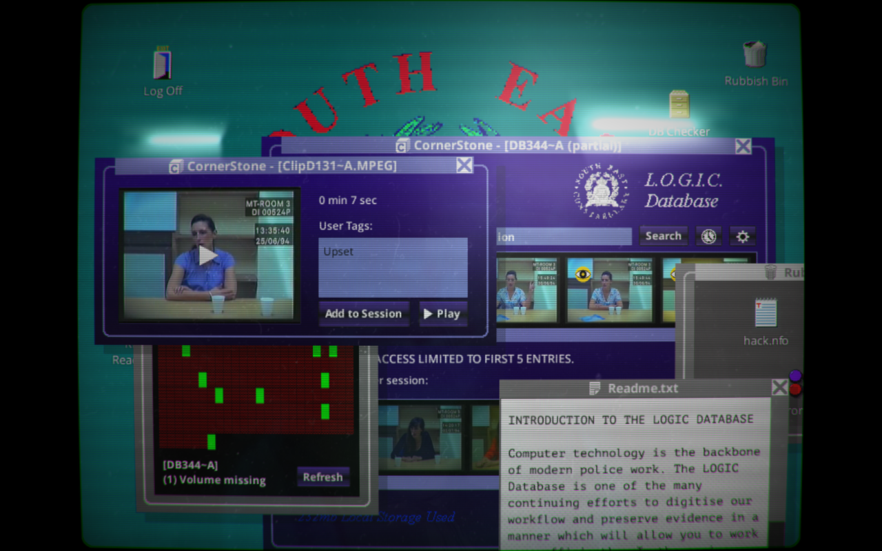
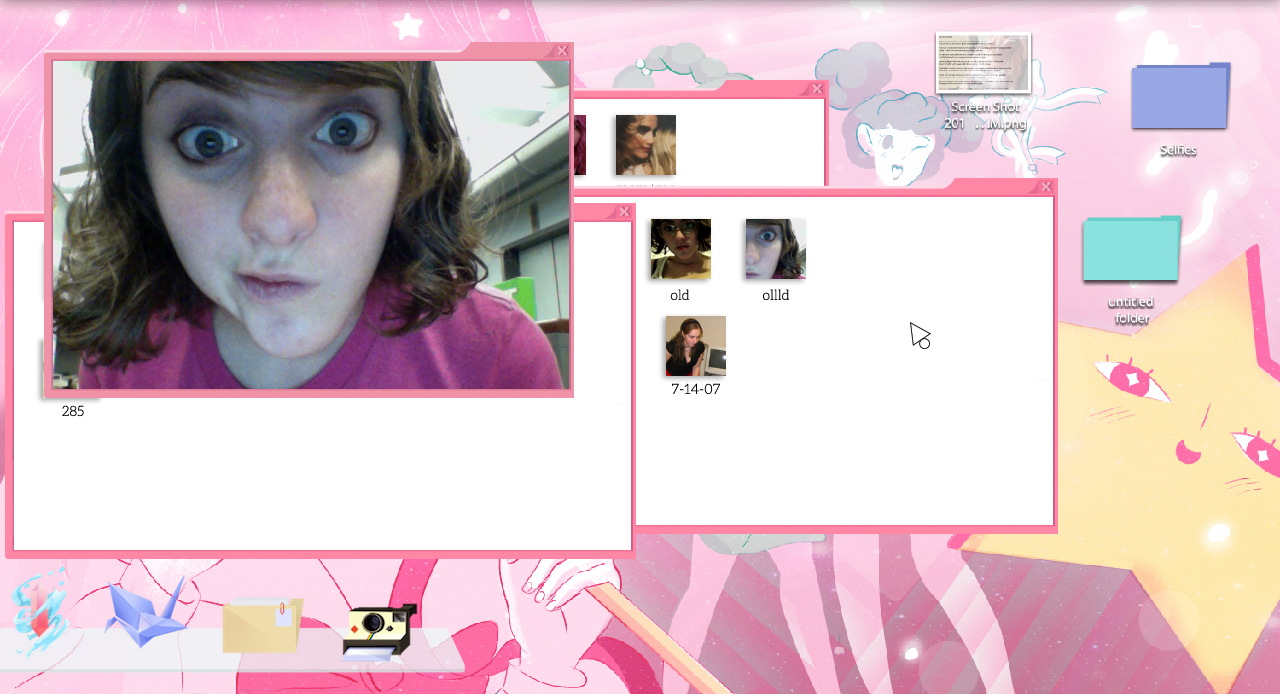
Secret Little Haven by Victoria Dominowski
A couple of mine too…
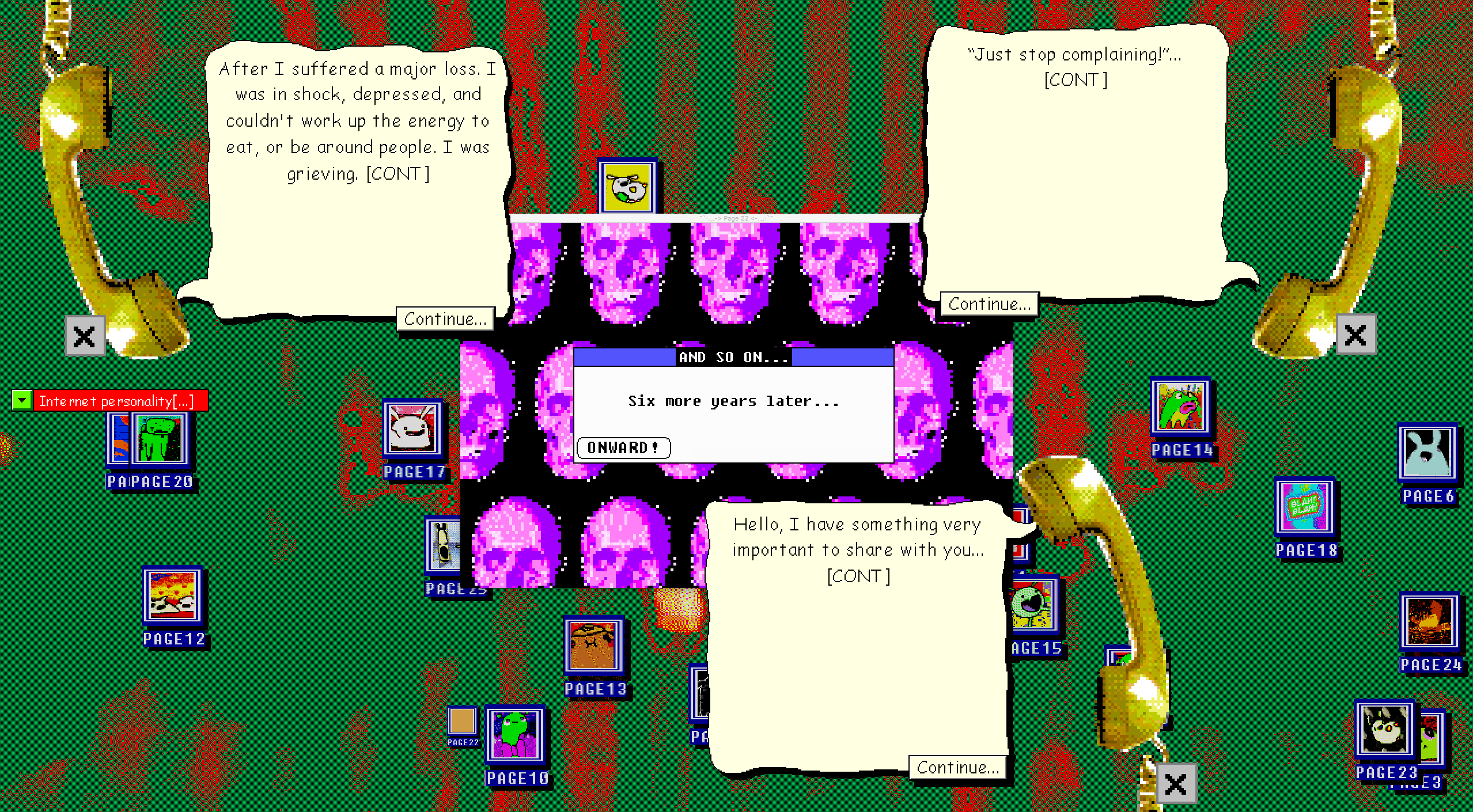
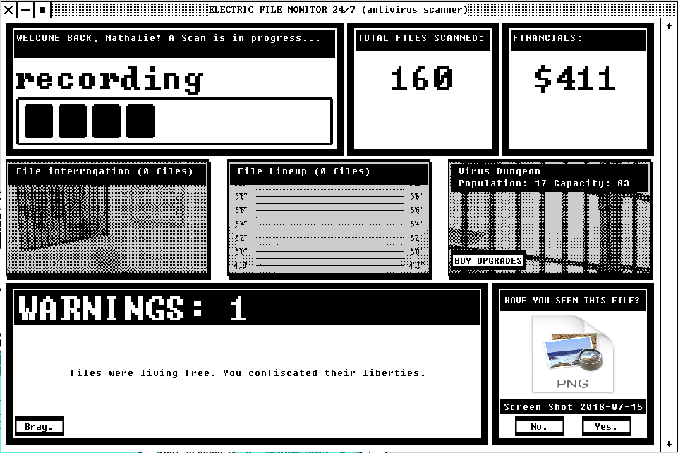
The above are all examples of games that incorporate UI in unique ways, in which the UI is the main source of interacting with the game.
These games largely play out through UI… I think examining these are a wonderful stepping stone in the direction of looking at UI as something interesting.
UI can be part of your game to such an extent that it is indistinguishable from your actual game. THIS is really the optimal way of looking at UI. A good UI is completely part of your game.
A lot of views people hold when they approach building a UI really bothers me, because I think people generally misunderstand the purpose of UI.
For example, UI is viewed as a necessary evil. It’s kind of like some element in the corner of your game that lets players adjust some setting, or manage saves…
Generally, UI is strongly separated from a game’s world. It’s tacked on at the end, instead of something that fully incorporates to a point that it is part of your game’s world. Like I said, the latter is the optimal way of approaching UI.
UI is another creative space for you to explore that can inform your narrative, build on your world, or just generally be a really cool space for people to tangibly interact with your game on an explorative level.
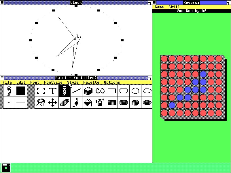
The first step of getting away from our misconceptions of UI is to break out of our mindset of what UI even is. Just get away from sliders, bars, numbers, knobs… There is no reason to adjust a setting by any of these default ways. You can allow a user to change values a whole lot of other interesting ways.
If you view UI as a living thing, with functionality that’s tied into your game, but still part of the virtual pace that you created, then things get very different…
If all this is starting to help you get past your views of UI, great. Here’s a small tangent that I hope will help you REALLY get away from “UI is supposed to be this” mindset…
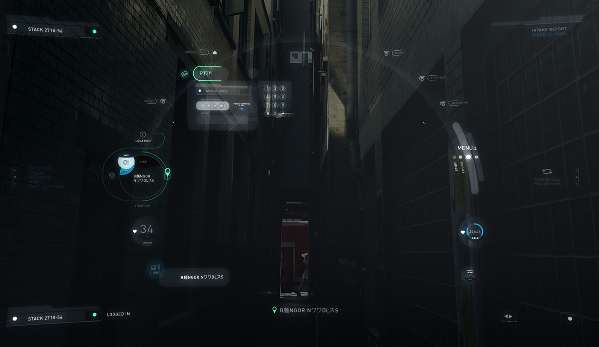
An interesting field to look at is “fantasy UI”. This is kind of an area of UI design that doesn’t exist to incorporate with any system, but is there to just LOOK good, and techy, and cool, and mysterious… Sci-fi!
Movies often hire motion graphics designers, or designers, to invent UI’s for their fantasy world.
You REALLY should pay attention to this kind of work when you watch a movie. It’s a good stepping stone away from our current UI box that we’re stuck in.
Artist GMUNK made the UI design for the movie TRON.
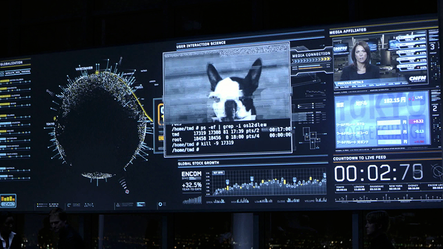
Image re-posted from GMUNK’s portfolio
Also from GMUNK is…
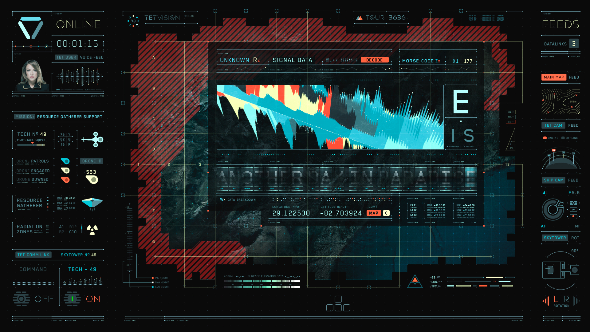
Image re-posted from GMUNK’s portfolio
GMUNK is a really amazing motion graphics artist to look into for this type of work.
Literally, any sci-fi movie approaches UI work in interesting ways. When you watch these shows or movies, do pay attention and notice how all this incorporates into the fictional world…
Images from Altered Carbon UI design from Rushes Creative
Look at the UI work on the TV show Altered Carbon.
For example, this Behance from Rushes Creative.
What we can take away from these UI’s for “fantasy technology” is the way they fit into the fictional world. When a character accesses something like a HUD, it doesn’t revert to basic sliders, and volume bars…
You see something that really looks interesting. It fully incorporates into the fiction, and the way the UI is presented even BUILDS on the experience. The UI fully enforces that narrative.
For games, this type of mentality would be optimal. UI is part of your game. It doesn’t have to be a necessary evil that’s added at the end.
The above games that I mentioned (Cibele, Secret Little Haven…) all do this type of UI work amazingly because they fit into a certain “UI history” that we all recognize, so their incorporation is more understandable (from a narrative point of view)… If your game is not about “nostalgic throwback” to desktops and internet, then it’s up to you to carve out what a “nostalgic throwback” might look in your own game world.
Even if all this sounds like too much, and just reverting to sliders and nobs and volume bars sounds easier to you… Then try adding tiny details to that space. Maybe hide a little virtual companion behind the UI for a player to find.
It’s really important that you view UI as an actual SPACE. It has dimension, depth… It’s an environment for functionality to live in. Designing it is no different from designing game mechanics.
UI can be a very powerful way of communicating emotion, story, or carrying a lot of nuance. It can do the work of informing your story, just as much as the game.
UI absolutely IS a creative outlet.
It’s another space for you to design.
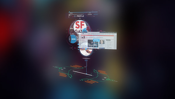
UI becomes boring when you view it under misconceptions of what it’s about. I think because we’re so used to engaging with just a certain type of UI (Desktop, mobile) we tend to misunderstand what it can mean in context of a game.
It can help to understand UI in context of computer history, and look at how it evolved out of our varying needs to interface with machines…
UI design is a commonly agreed upon language for interaction.
For example, when you show someone a window, we all know that closing it can be done by clicking on the button with a cross icon at the top. We know that the bar at the top of a window drags it…
This is our interaction language. Dialects may vary depending on what platform you are using.
That agreed on language is only a guide in a direction. It’s not meant to hold back your creativity. If you understand that we all know how to close a window, you can experiment with that implementation in context of your own fiction.
Consider the history of UI’s, and track their evolution…
UI came out of a need to make a computer accessible to people through more natural interfaces, that didn’t involve typing.
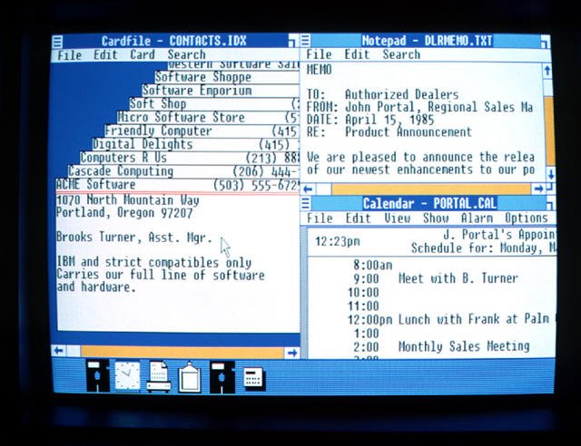
Before we had Windows, we had to type commands. This could be tedious. Once things became visual, more work could get done.
These early interfaces were designed to be accessible, and kind of serve as a friendly environment. The word “environment” is the key here…
When I say “friendly environment” I mean that it replicated an environment that people felt comfortable in. In context of the work being done on computers at the time, that was an office space.
Look at the desktop (the word “desktop” is even illustrative of an office). The desktop is a space where our personal lives live. Programs are inhabitants of it.
UI evolved from the concept of a “desktop”. Our interaction language came from an “office space”, and our current virtual spaces still heavily reflect that.
You have folders, files (depicted as varying illustrations of paper), you have directory structures that mimic filing cabinets…
If you look at some of these old-school UI’s it’s almost like a surrealist fever dream where real world iconography is roughly mimicked in a strange virtual space.
We’re really used to these spaces, so it’s hard to look at them from an “outsiders” point of view, but they actually are really weird.
UI evolved from that “office” use case. That use case was the predominant market for computers.
If we see that UI could have evolved to depict ANY environment (serving ANY other use case or market), then things get a lot more interesting.
We can question our habits of mimicking that same visual history.
Why mimic functionality that came out of an “office use case” when your game is about something totally different?
What if the UI evolved out of some aspect from your game world?
How would your game world inform UI?
How would that look?
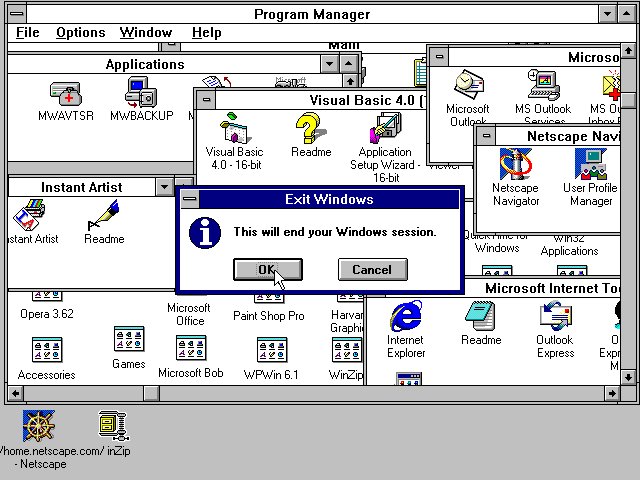
Early attempts to re-invent what a desktop space can be are an interesting concept to look into…
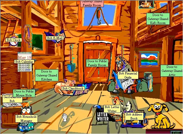
For example, Microsoft BOB
And 3DNA Desktop…
Early computers had initiatives to “re-invent” what a desktop space is.
Admittedly most of these failed, but I think the underlying reason for doing this is important to understand.
It was interesting, and exciting, to try to re-invent a virtual space. The “3D desktop” was kind of a late 90’s/early 00’s dream. I remember websites even trying to be this.
I think these are important to examine for how UI could have grown out of a necessity to interpret any other environment. If the original use case for a computer were less about calculation, office work, spreadsheets, writing… and more about (rough example) space wars, mining on colonies, sorting colors, arranging things, autobiographical writing…exclusively about games… what would a desktop look like? Would we even have icons? How would we have agreed on structuring information? What would our interaction language have looked like then?
So… Instead of an “office” (or anything even remotely a relic of that) how would it look if your game were part of UI history? What kind of abstracted visual language would evolve out of your game’s environment? How can your game inform that interaction language?
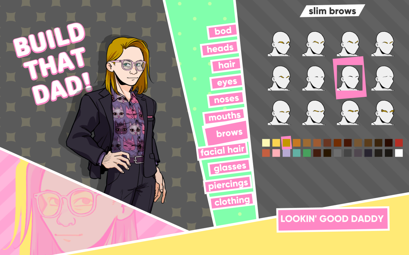
Two wonderful examples here are…
The Endless Express
and Dream Daddy…
Like I keep saying… Instead of tacking UI on at the end, and therefore separate from your game… It’s really valuable to explore how UI (as well as that coinciding functional language) can fit into your game-world, as PART of the world.
UI is not just a flat space. It’s capable of holding a lot of dimension. It literally is an environment.
How interesting you design that environment to be is up to you. Functionality does not have to be JUST functionality.
Since UI is an extension of your game’s environment that can further inform your game, I think (as game designers), we should experiment with UI and re-invent what that even means to us. Each game is different, so each UI approach can be unique to that game.
For example…
What is a UI to us?
What is a UI to our game world?
How can a UI communicate what your game is about?
How can UI build on your game’s narrative, or further build on your world?
How can UI naturally incorporate into your game’s virtual space?
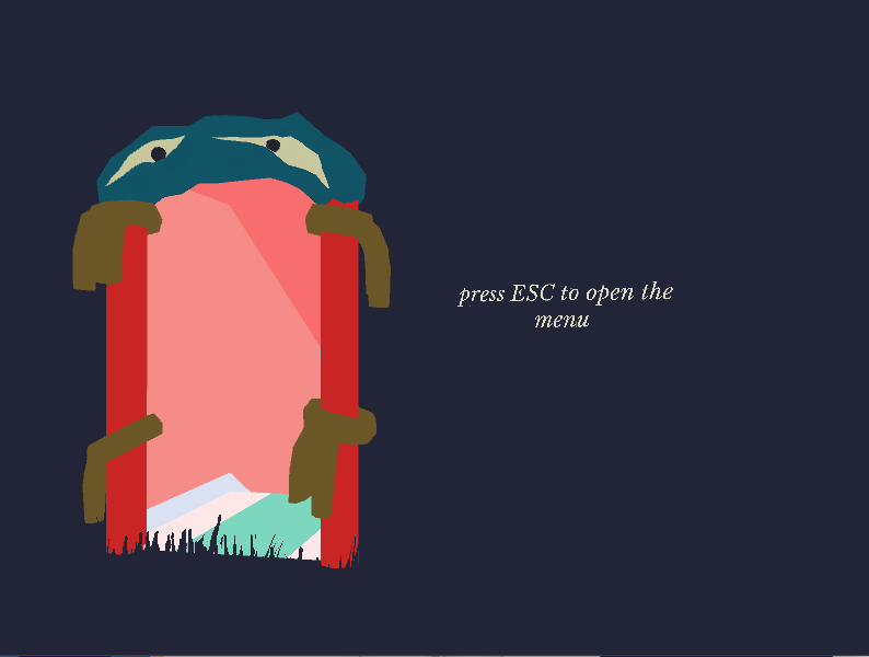
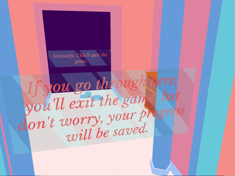
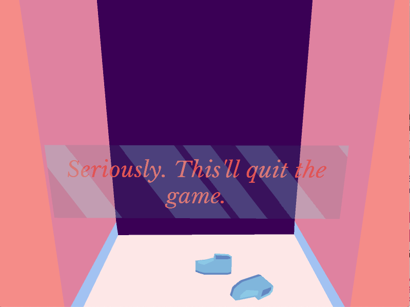
An amazing example of this is the game “The Endless Express“. This is just brilliant.
The menu in this game is treated as part of a space in the game that you can walk around in. You open the menu by placing this strange virtual door (it appears out of nowhere, when you call it). You walk through this door, and you’re in a completely different part of the world. The way UI was approached here is a massive achievement, imo…
If you think UI is boring, maybe step back and find a way to eliminate even having one. Do you even need it? Are there other ways of achieving the same functionality that are more part of your game? Can your game itself maybe make that functionality accessible, and completely by-pass the need for UI?
The functionality that you need (saves, volume, etc…) can be made accessible in a lot of other ways.
It’s not an optimal design practice to incorporate something just because everyone else has it, or just because “that’s the way it’s always been done”…
Sometimes you’re better off with no UI at all.
Since I’m talking about experimenting with UI, the question of accessibility will come up…
I’d like to stress that experimental UI does not have to mean inaccessible.
Accessibility is also very misunderstood as something that has to mean “boring”.
No! That is also sad. Accessibility is also a language that you should approach on a use case level. You can’t force the same accessibility approaches for everything. This is often why things end up not being accessible.
(3DNA Desktop – via http://toastytech.com/)
I think a lot of UI suffers from a fear of experimentation because we’re afraid that experimentation is associated with “inaccessibility”.
Granted, some experimentation can be that. My own UI work is often heavily influenced by what I personally want or like (so my stuff is not exactly a good example when it comes to accessibility).
Nevertheless, it’s really important to step back and question why we feel like diverting from certain user experience (UX) rules, especially in our games, means that our UI will be inaccessible.
It’s necessary to acknowledge that UX rules apply to certain use cases. They are not the best for EVERY UI case. UI and UX are universal languages, with standards that we all agreed on, but it’s up to us to question if those standards fit into our work. For interaction design, this is important because things you interact with are often wildly different.
UI/UX on a mobile phone is completely different from UI/UX on a desktop. If we forced mobile to conform to our desktop approaches, then that would be much less accessible than just coming up with a new UX language for mobile.
So UX rules apply to certain use cases.
I feel that a lot of modern UI today can be fairly inaccessible because we don’t question where our design habits (or tendencies) come from, and if the way we are presenting things to a user is even optimal.
Your game world is wildly different from the interface environment on a mobile phone, or the environment that a desktop is, so why restrict yourself to these languages?
It’s valuable to ask; are we really following a good accessibility rule, or are we designing out of habit?
UI in our games should be treated differently than UI on other devices. Inaccessibility can happen when we don’t question where these habits come from.
Is your approach even the right way? Is a certain feature even necessary?
UI that fully incorporates into your game world is A LOT more natural, accessible, and friendly to people than a UI that is treated as something completely separate. People already know how to interact with your game (you communicated that interaction through your design and mechanic), why are you asking them to interact in a completely different way when it comes to UI (saves, and settings)?
Can that maybe just be part of your game too? If you do it right, it would be easier…
Just because everyone is designing UI a certain way, or we are under the impression that it should be a certain way, doesn’t mean that it’s optimal.
This is especially true for UX, which comes from the necessity to monitor how users interact with a functional environment, and then fine tune the UI (our design) for an optimal experience.
Each case is different. These rules (often meant for varying cases), aren’t the end-all.
For example, no two games are the same. When we design games we also worry about accessibility in our mechanics, difficulty level, the way it’s played… So (again) UI is the very same way. You should base it on the needs of your game, the way a player navigates your game (world, story, functionality), and build on that.
The best way of doing that is to approach UI on a per-case level.
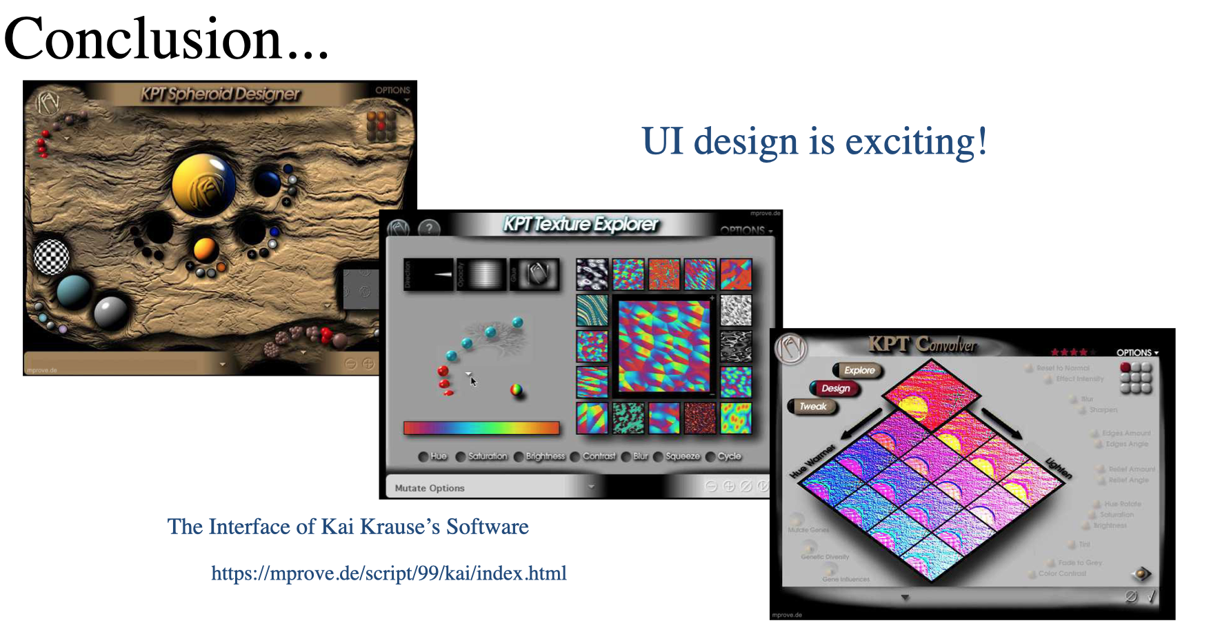
Via: The Interface of Kai Krause’s Software
In conclusion…
Design habits that lead us down the road of “that’s how everyone is doing it” make UI a largely misunderstood space.
Sometimes even using UI components, libraries, or UI specific API’s can cause us to slip into these counterproductive habits. What works in one case, might not be optimal for yours. UI can be so much more than that.
It’s really important to look at UI as something that you CAN re-invent so that it fits into your own virtual space. It can really be part of the experience that you are building.
Bad UI is separate. It takes you out of your game.
Good UI fully incorporates into your world. When you do it well, it’s so seamless that a player won’t be able to tell the difference from being in a UI and being in a game. Good UI is fun to be in.
Try different mindsets when you approach UI design. Ones that treat UI as a living space, an element that informs the story, something that builds on your game world…
Explore how UI can be emotional, build narrative, actually BE a space… something that fits into your game to be as evocative as your game world is!
UI is an amazing space to creatively explore.
UI is exciting!
1 Response
[…] and EVden eVE NaKliYaT other major Evden EVE NAkLiYaT cities of the state. Each company profile incorporates contact info, but in addition shifting rankings and evaluations, written by actual prospects, […]