I rarely ever do “art posts” where I explain the thought process behind the look of the game, so I thought it’s about time that I do something. A lot of planning goes into it, and I’m certain others will find the general philosophy interesting.
This is about the new “desktop” version of Tetrageddon Games I’m making. It’s coming to Steam.
Small video about the project:
So…
The new experience has a lot of new art, and animated transitions. Think of it as a very large, “interactive animation” with games here and there.
The art is largely vector art. This makes it very scalable, and it simply looks beautiful full-screen (no loss in detail or quality). It’s my rule. Use vector as much as possible.
I realize that this impacts performance a lot, but (to be honest) I don’t care. This is a game, and games use resources. In comparison to many 3D experiences, this doesn’t use more than those.
Also, our mindset is just a bit flawed when we (game developers) complain about vector art. We’re OK with 3D using lots of resources, and expect that, but anything else (2D) should not do that.
I’m thinking, in this case, I should push vector to a “new” level and see how far I can take it — same as what people do when they explore pushing 3D to the limit, but with traditional animation instead.
For example…
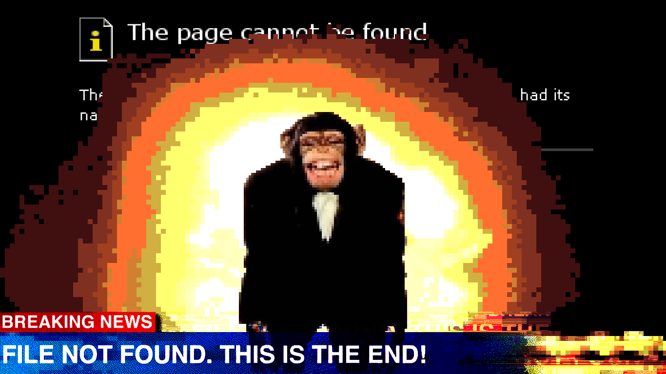
![]()
It’s been pretty fun so far! I love vector-based pixel art. It’s so much easier to work with.
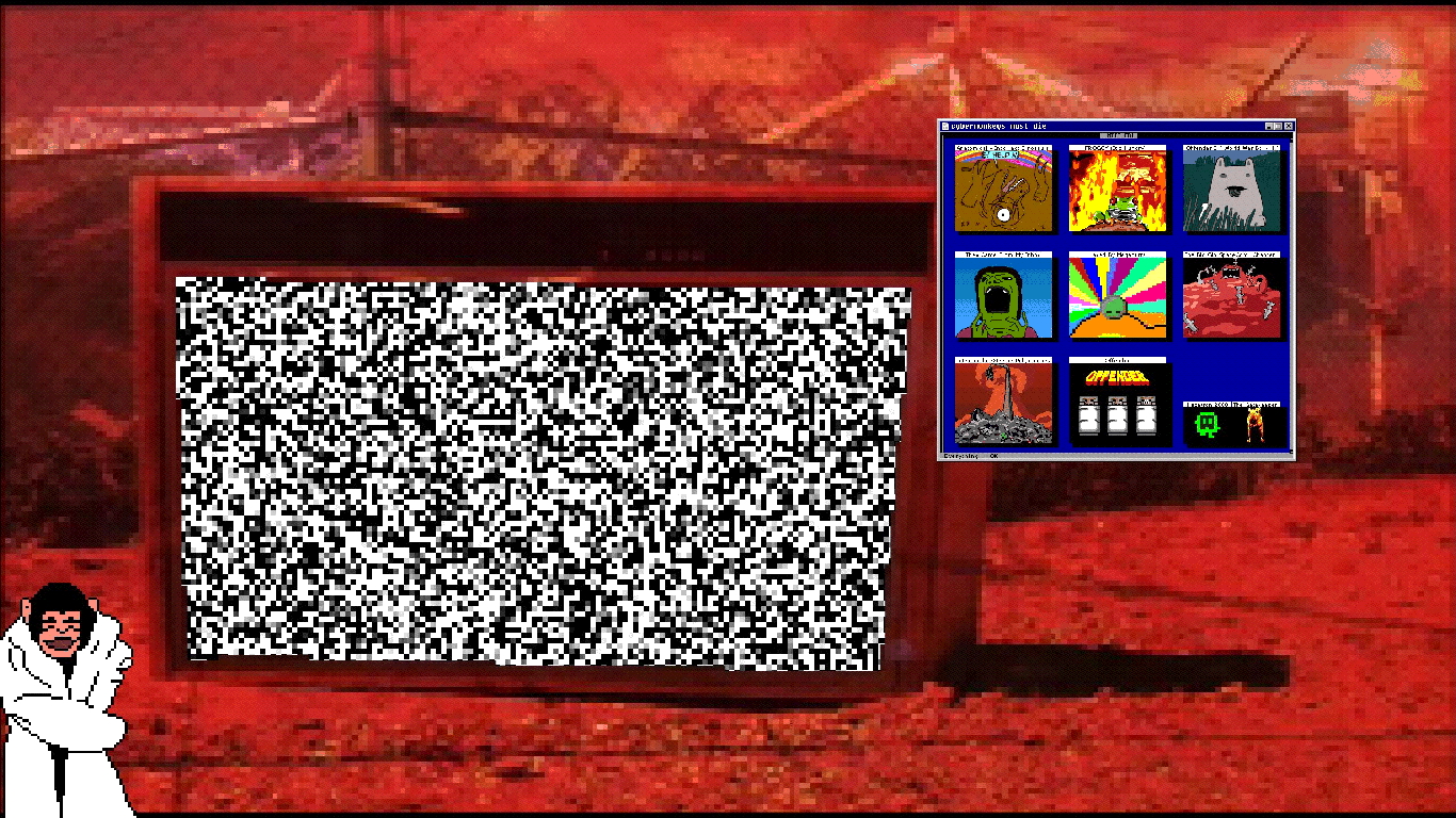
I’m putting a lot of work into the new “Main Menu” (I call it main menu for a lack of a better term).
I have a bunch of “random interactive backgrounds” that play behind the select-your-game window. These are strange random things. So far the most complete thing is the TV — you can channel surf “weird TV”.
Others will include characters from the game cheering you to play their game, and “boo-ing” the other games… You get the gist of it. It’s kind of like channel surfing, or surfing the internet. It’s all broken, unrelated, and lots of strange impressions to flood you with.
There are also more easter eggs planned. I won’t get into those because that’s very “in flux” at the moment. Have to plan this better.
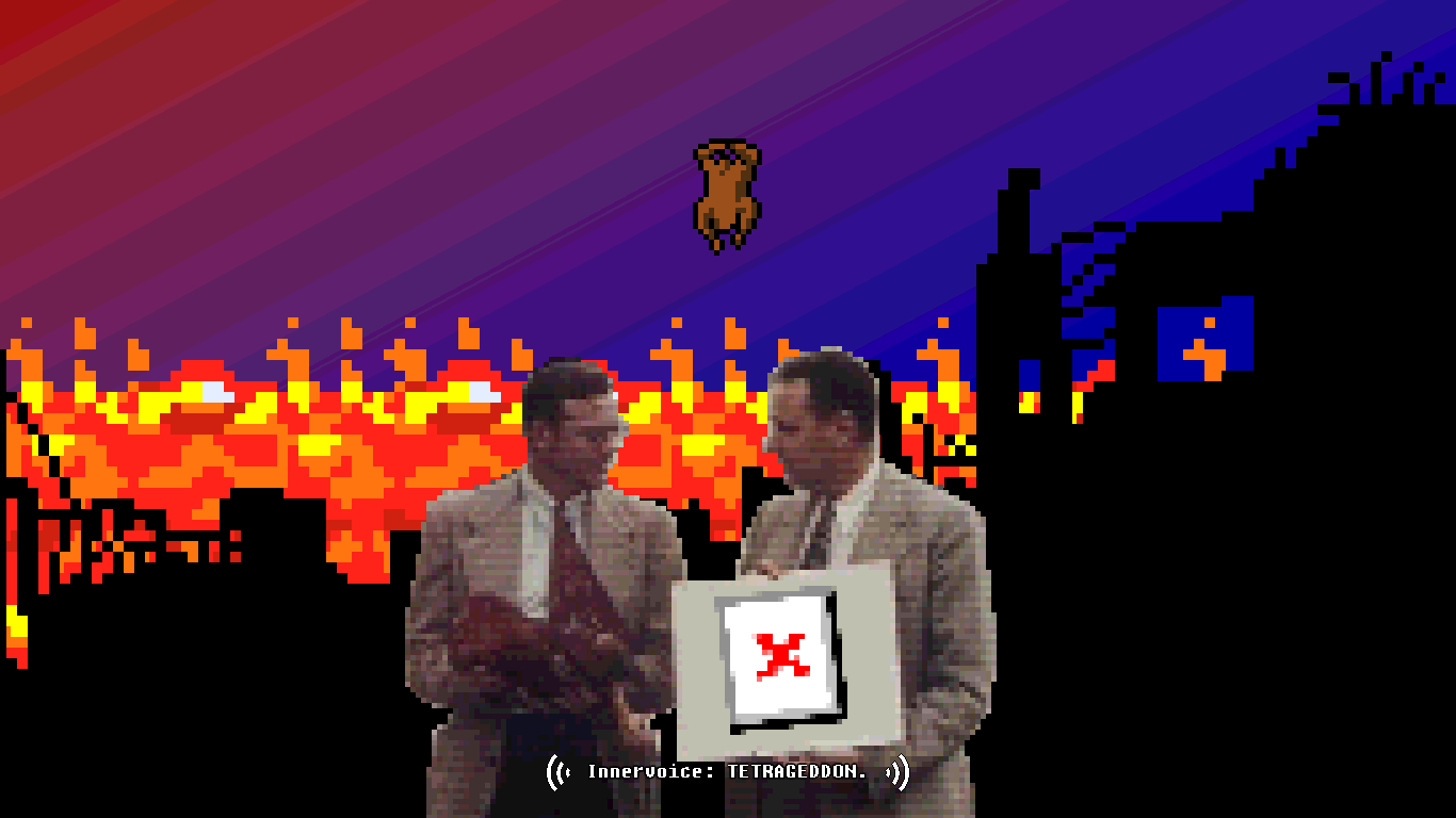
Aesthetically…
The art style for the new content (transitions, animation, and mini-games) will serve to “tie together” all the games.
Visually speaking each game looks, and often functions, very different. There are a lot of independent pieces with little consistency (which can either be a good or bad thing) — I hate consistency, but I think adding some to this will make it a better experience.
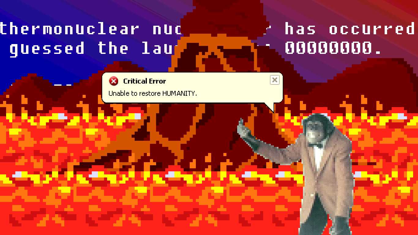
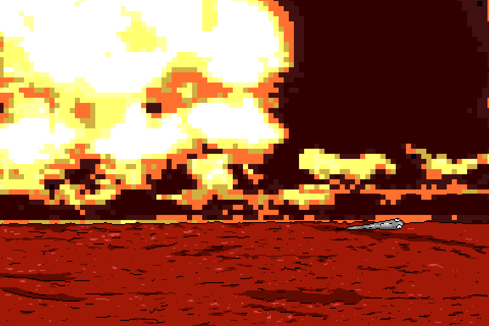
For example, my current one is GOGOFish (Redux):

It’s mixing the same aesthetic that the main menu has, into the game. The game itself is more of a joke. The joke being in the interaction. It’s going to be “small” (exercising restraint here so it doesn’t grow into an actual game), and hidden in one of the “main games”, as a “and now for something completely different” thing.
![]()
By making new mini-games (hidden through-ought), that have a consistent aesthetic, which all fit with the “main menu”, and these mini-games come and go as you’re playing the main games, I feel this will tie things together more. It also adds a new level of complexity.
“Layered” is a good word.
Tetrageddon Games (for the desktop) is going to have many layers of interaction, play, and visuals. It creates a type of complexity that will reflect the web-version well, but in a non-web environment.
I mean, in the end, that’s what your desktop is. It’s a layered mess of windows, icons, and you “dig down” whenever you interact with it. It’s not at all linear. The web is more of a linear platform, in navigating from X to Y (sort of like “choose your own adventure”)… Interesting observation, at any rate.
So that’s the visual, and interactive, model to follow.
The visual style for the new main menu and games…
Low-fi, old-school UIs, DOS, error art, and glitch will be my main form of visual communication.
It’s interesting to note… People often try to completely “clone” that retro look, but I have found it to be more interesting to (instead of cloning) imitate it in the way you remember it.
Don’t look at style/design references (do that as little as possible), and draw from memory instead.
More often than not I have found the way I remember it to be much more interesting than how it actually was.
For example, I had a very complex memory of Super Mario World — it turned out to be much more complex than the game was when I played it through again.
It’s sort of like when you have “game dreams” (dream about a game you’re totally into). It’s some strange, alien, weird abstraction of the actual game (Eversion did this pretty well). I wish I would have written it down, because the memory itself would have made a pretty crazy game.
This is exactly what I explored with FROGGY (It’s Hungry). I made a (type of) game that I remembered playing, but it’s not a clone of the experience. It’s some strange abstraction of it. I think this makes using the “retro theme” a lot more interesting.
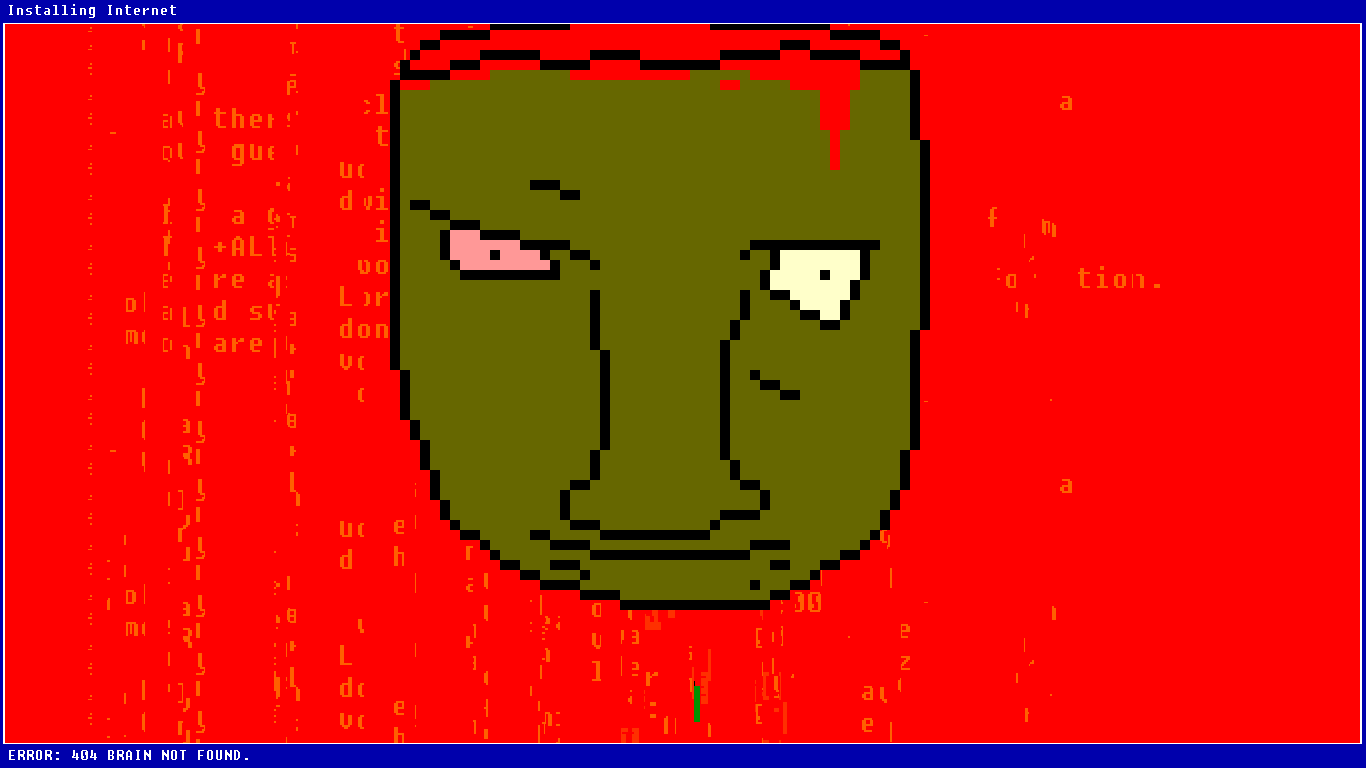
Working with Tetrageddon’s “new lowfi look” has been interesting. Mixing every conceivable element (video, photos, pixel art, and especially errors) makes for this blended alien computer thing. It’s kind of retro, it’s kind of not. I don’t know what it is. It’s broken and looks wonderful that way.
Video is especially fun because it’s my collection of weird finds from archive.org (Prelinger mostly), and I’m running it through a process that I jokingly call “Deep .Gif-ing” :)… I make a .gif, I make it a .gif again, and again… at some point the quality deteriorates and it looks pretty cool, and strange distortions happen. I have my own custom tools now too that I’ve been thinking of making better and releasing, but I digress…
I then break that .gif apart to frames, and edit each frame individually…
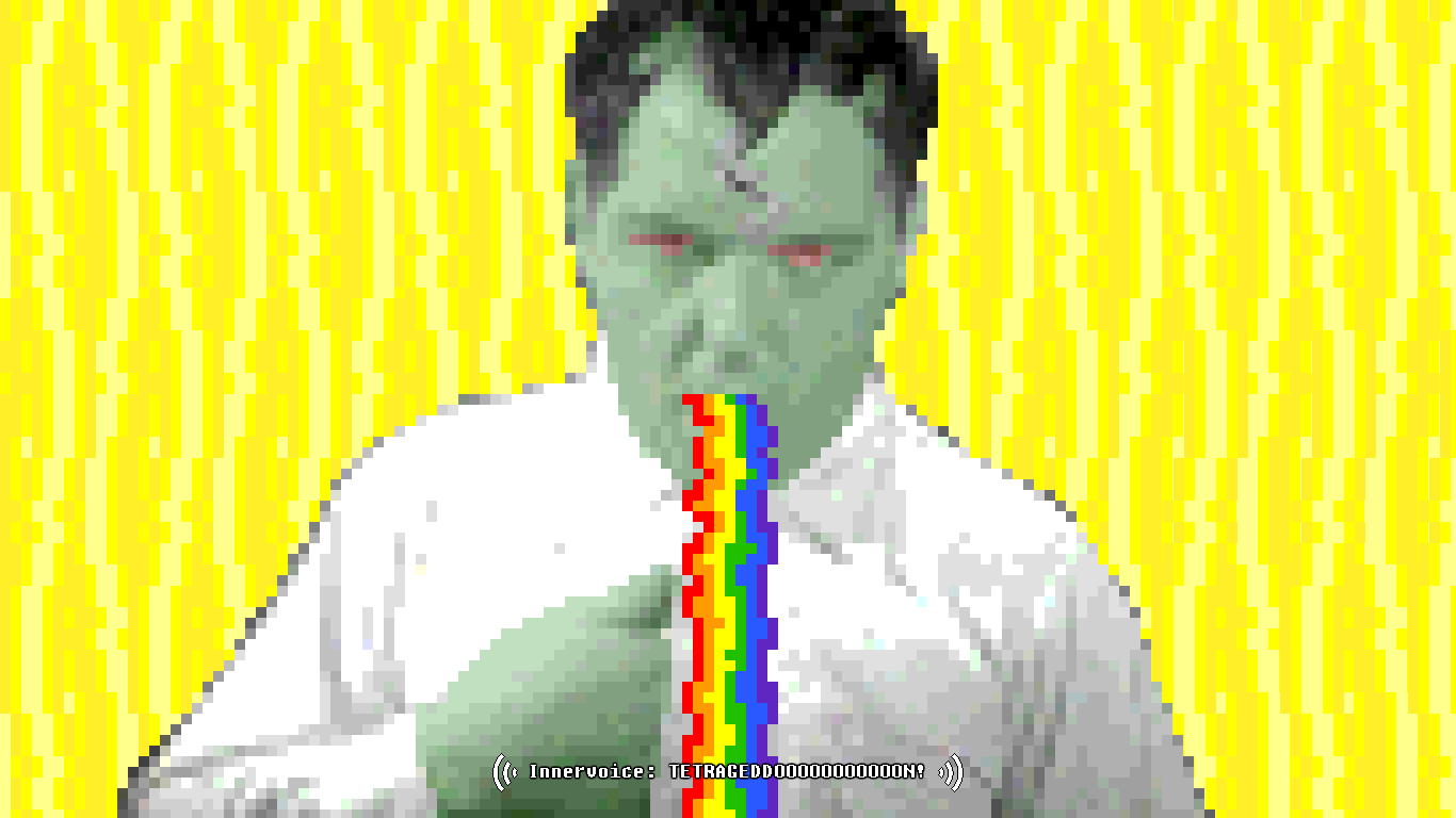
![]()
Approaching this like a “traditional animator”, each frame is important to me, so I apply these effects to each frame manually. This may seem like an incredible waste of time (when you could just run it through your program and apply any of the default filters), but (in doing it this way) I get a more unique look that is harder to accomplish with messing with video filters.
I’m also a control freak when it comes to this. This gives me a lot of liberty to add unusual details.
In the end, it is a good mindset to have: every frame matters.
Combine all that with a vector layer, and it looks crazy.
Why everything looks better low-fi…
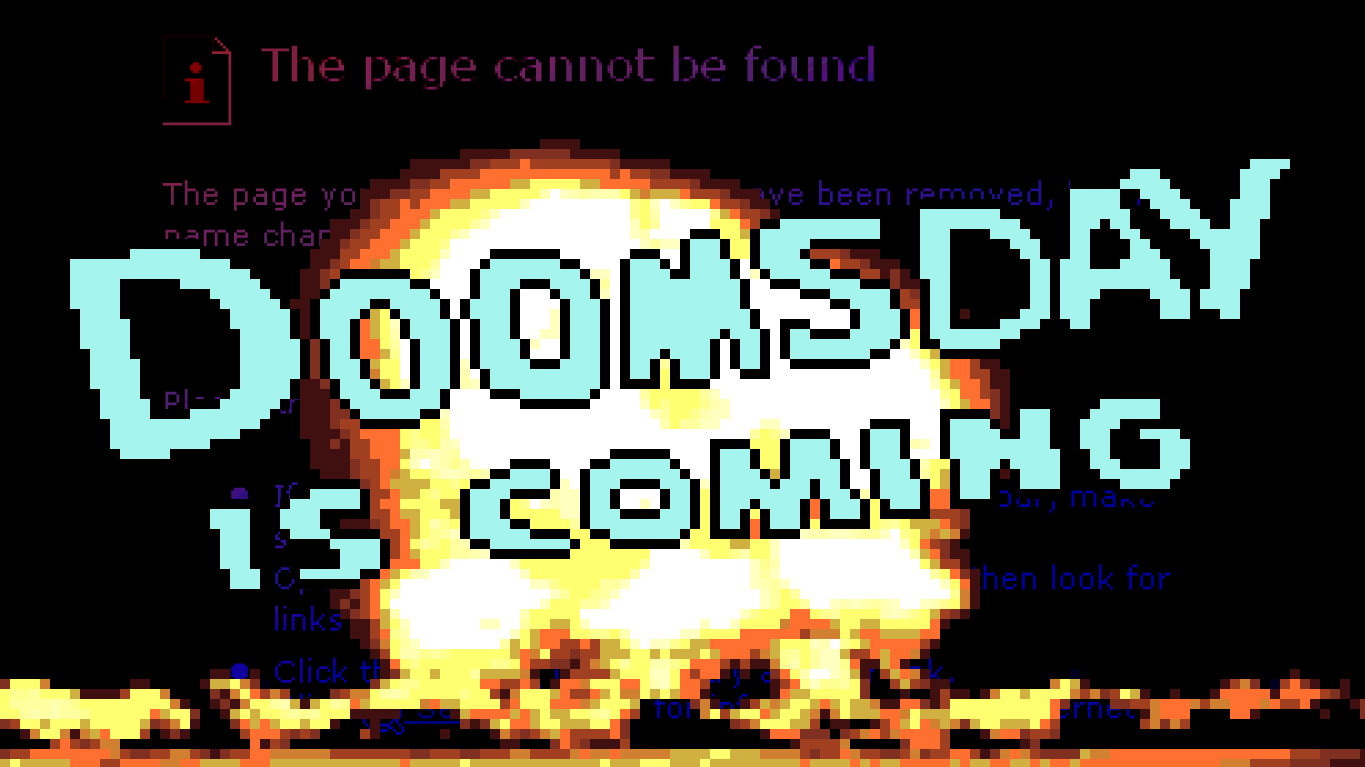
Things are more interesting when they break. :)
There’s a certain alien nature to distortion. It’s weird, and like the computer version of Surrealism.
Philosophically, computers have their own reality. We expect, often demand, a certain behavior from them. Good user experience rules… When I press close it closes, a window drags when I press the bar, a URL works this way, an icon that way. There are many constants. When you take these constants and distort them, both visually and behavior, it actually makes something frightening.
Sort of like if reality stopped functioning the expected way.

The power here is often in subtle changes. I explored this quite a bit in Anatomically Incorrect Dinosaurs, and I don’t think I did it enough. I want to do that even more. It’s a fascinating concept that I really want to master.
So applying all this to the new version of Tetrageddon Games will, I think, make something like a visually intense alien world.
Sort of familiar, but not. It also blends well with comedy. I really like where it’s going.
P.S.
Thank you to everyone for the reactions to my previous post. It means a lot… especially to keep reminding myself that I’m “not totally alone”.
I’ve determined that I really have to stop reading tech news. It’s become just soul-sucking. :(
Also, some cool news! :D I’m in a video here: VIDEO: Fantastic Arcade Wrap Up We chat up the weird wonderful gaming fringe with help from the Daily Dot with other totally amazing game developers. You must check out their games. They are quite inspiring!
Fantastic Arcade was totally awesome.